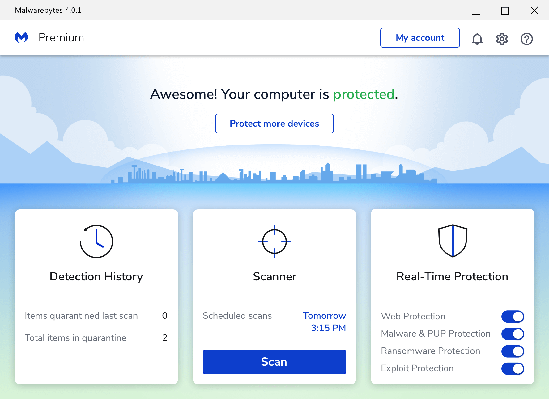
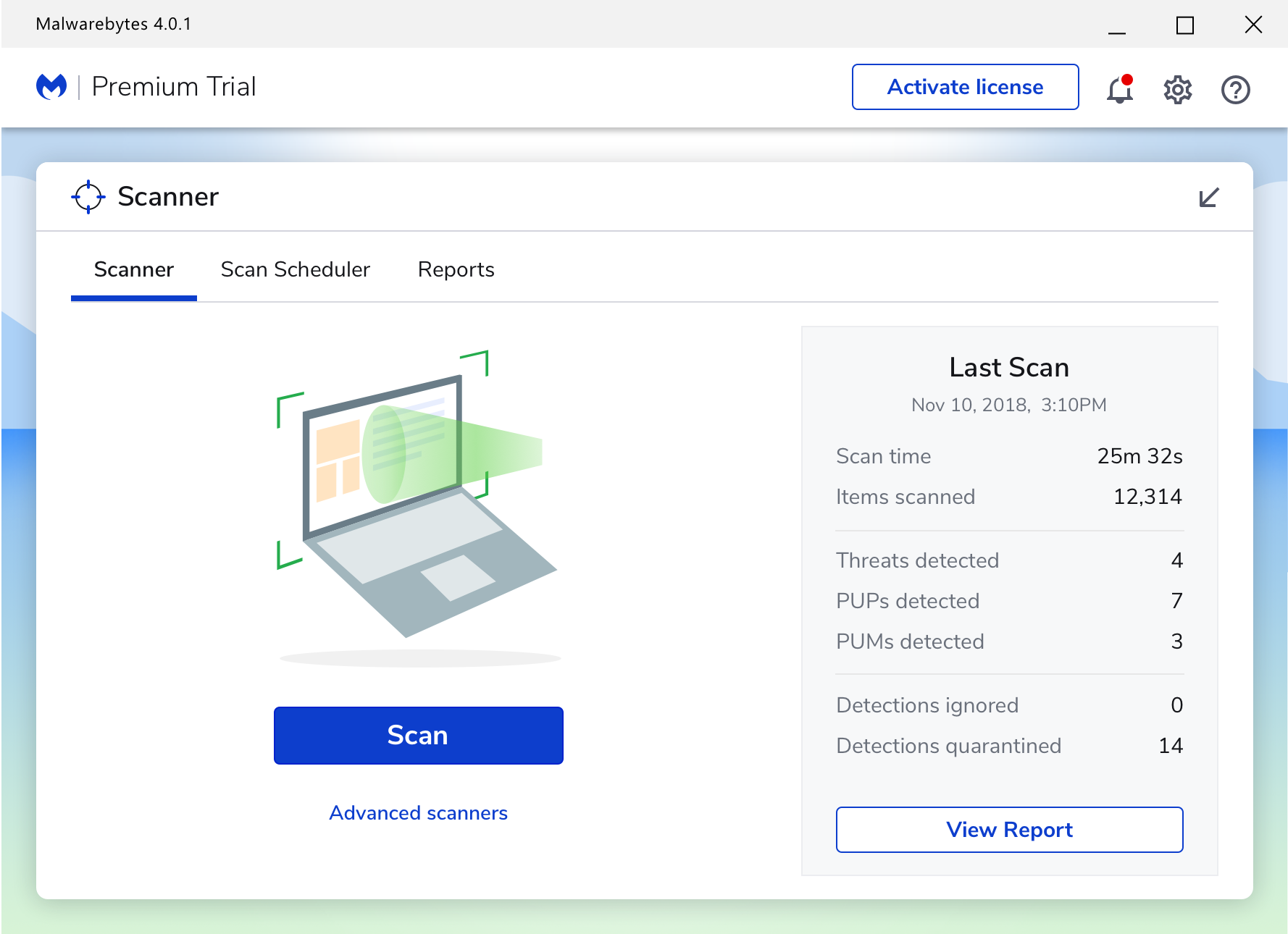
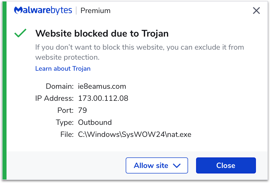
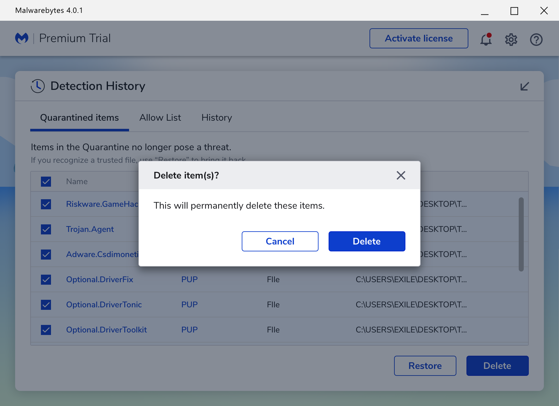
Imagine a world without malware. We do.

About

Malwarebytes Premium is an an anti-malware program by Malwarebytes inc.
It’s designed to protect users from malware, ransomware, exploits, and more.

Reviews

PC Mag review

5/5 - Usability
“As for Malwarebytes, it took four points for protection, five for performance, and five for usability.”

Published: 2019

SafetyDetectives

5/5 - Ease of use
“At first glance, the dashboard looks complex, but it’s actually very intuitive and easy to navigate.”

Published: 2020

My role

Senior Product Designer

I was tasked with conducting an end to end redesign of Malwarebytes 3.

In order to create Malwarebytes 4, I worked cross functionally with various stakeholders, developers, researchers, and more.

I developed the architecture, interactions, prototype, and some of the visual design. I also helped envision new features and how the product could scale for years to come.

Goals

User-Experience

1. Create a user friendly application that provides a feeling of security and empowerment.

2. Locate and remediate user pain points in the current sotware version.

3. Ensure that users know the status of their protection at all times.

Business

1. Increase revenue and user retention.

2. Reduce support calls.

3. Incorporate new branding and visual style.

A sample of challenges and solutions

Challenge 1

Re-designing the dashboard


Stakeholder requirements

1. Enhance usability and desirability.

2. Make sure users understand whether they have Real-time protection or not.

3. Stand out from our competition in visuals and simplicity.

4. Represent our values as a company.

Old dashboard
Research

In order to redesign the dashboard, I spent time learning from the product manager and ux researcher about who our users were, known pain points, feature requirements, and how our company was perceived.

We ran user studies, reviewed user comments in message boards, and spoke with our phone support staff.

Key research findings

1. Our users know and love the big blue “scan” button. It's the first thing they interact with after installing the application.

2. Above all, users want to know if they are protected.

3. Easy access to manipulating real-time protection is important to our more technical users.

4. Users want to know if there are any items in quarantine.

Some early concepts
Final designs
Re-defined global navigation

Originally, each global navigation point was an object except “Scan”. Mixing objects and actions increases cognitive load and our research proved this to be a pain point for users. They weren’t sure if clicking “Scan” in the navigation would begin a scan or take them to a place to begin a scan.

I alleviated the pain point by re-defining the navigation into three main objects that were most used by each of our personas.

Big blue scan button

Knowing that most user's first interaction with our application was clicking on the big blue scan button (they had come to recognize and love), I made sure to keep it visually pronounced and centered on the screen.

Clear status messages

Our research showed that in the past, people would become confused as to when they were fully protected and what they got out of their premium protection versus trial state. Therefore, I worked with our copy writer to maintain clear and concise messaging.

I also added a greeting message informing them of what their Premium trial provided them with when they first started it. The “learn more" and “upgrade” buttons also provided the user with more information about their protection.

These changes resulted in increased retention and over all revenue, as well as a reduction in support calls.

Trust and desirability

During our testing, we found the protected cityscape invoked trust and desirability.
We also received a lot of positive feedback on our dark mode.

Challenge 2

Simplifying scanning


How it use to work

When running a scan from the dashboard in the old Malwarebytes, the application would automatically conduct a “Threat scan”. However, when users navigated to the “Scan” tab, they were greeted with three scan options.

Pain point

When users download Malwarebytes, they are typically in a hurry and worried that something has infected their computer.

The old scan page would stop them in their tracks and force them to read long descriptions of each scan type.

This left users confused and feeling as though they were wasting time. After their scan, many people would scan again or use another scan type to ensure their entire machine was analyzed.

Old scan page
Solution

I spent time talking with our engineers about all three scan types to better understand how each one worked. I learned that the majority of our users only need to run a “Threat scan” on their computer.

To reduce user’s cognitive load and confusion regarding each scan type, I brought forward the most important one and placed the other two a level deeper. Regardless of whether they start the a scan from the “Scan” button on the dashboard or inside the “Scanner card”, it runs a Threat scan. Our testing showed users appreciated this and felt confident in the scan.

User response

During testing, we found that participants felt confident our Threat scan (on the intial scan page) would take care of their needs. Their feedback was that the task of scanning was easy and left them feeling confident in the results.

New scan page
Advanced scanners
Challenge 3

Allowing blocked websites


How it use to work

In the old Malwarebytes, users had to go into the program and manually put in the URL of a blocked website they didn’t want blocked.

Pain point

Research showed us that users could never remember the URL of the website if they were blocked from viewing when they closed the window before copying it.

Solution

I designed a Windows OS notification that allows user to unblock a website right when it's blocked without having to open the program.

However, if the user missed the notification or wants to unblock a site at a later time, I designed a table that will list all the blocked websites for them. All they have to do is check the website(s) they want to unblock and click the “save” button. This alleviated the problem of having to remember a URL.

Windows OS Notifications
Allow website(s)

A sample of task flows

Flows may differ on macOS

Schedule a scan

Scanning

Delete quarantined threats

A sample of screens from the Mac version

Several features and flows differ from Windows

A sample of screens in dark mode